selectable colors for highlighed text

It would be good if the color of the highlighted text could be changed so that the highlights represent different contexts.

In Adobe Reader i use yellow for central statements, red for important quotations, green for examples and blue for definitions. In my opinion, it makes sense to have something like this in Memex.

A competing product, LINER has this. It was one of the features that made me take so long (about a year after I discovered Worlbrain) to start using Memex.

1 Like

I’d very much appreciate even if the default color would be different. When reviewing annotations from the Dashboard, it’s quite hard to read gray on green… It’s kind of a small thing, but looking at annotations is a crucial step for grasping the big picture about a topic, and it’s quite hard when you have problems with reading the text.

1 Like

Totally makes sense. Will factor this into the next release.

-Totally agree. Or reading this:

1 Like

Already on the map! Will be fixed in the next sprint.

Thanks for the note.

2 Likes

Just adding a comment (and vote) to say I’d like to see this implemented. I would use multiple highlight colors to differentiate between different types of information. Way quicker and works with my brain over highlighting and then tagging, which is a clumsy workaround.

Love the product, keep up the great work!

1 Like

Any update on this request? I seems like it didn’t make it into the sprint that @BlackForestBoi mentioned.

I’d also link these colors to different categories of text-analysis. in techniques on close-reading the following half a dozen categories are the bare minimum helping you make sense of a text:

once you have the highlights hooked to basic categories like “incomprehensible”, “major thesis” asf. you can beautifully visualize the impact of a text on its readers.

go memex!

2 Likes

Thanks folks for all the input here.

Not having on the radar yet to build it. Currently occupied to release the chunks of work for co-curating and co-annotating collections, then cloud support for multi-device sync.

@MikeK Sorry I could have been clearer. What I meant was on the map for the next sprint was to fix the highlights in dark mode not changing the text colour, rendering them almost unreadable.

New blue is nice, more colours like purple red and non-eye piercing green etc. would be great
Also the ability to unhighlight.

1 Like

Hope to have more color to be selected.I perfer yellow

1 Like

Also, the ability to add Labels/Names to the Highlight Color would be a huge game-changer. An example of this is Super Simple Highlighter and their highlight ‘styles’.

It’s a shame to see this not yet implemented. I tried memex 5 months ago and still haven’t switched from Liner because of this one feature. Highlighting is useless to me without progressive summarisation which requires different colours.

Hey there!

I was wondering how to implement this just recently and would appreciate your feedback.

Option 1: Make the bar left of the highlight the trigger to change the colour

  • is more straight forward and self explanatory but creates a disconnect to the rest of the data. You’d still have to associate it with a Space if you like to organise it. Means 2 steps potentially.

Option 2: Associate a colour with a space, and then when you add the space to an annotation it would change the colour.

  • Creates more consistent data but may run into issues if 2 spaces are associated and which colour to use there. However assuming that in most cases you only ever associate it with one space for your purposes.

What do you think?

1 Like

Hi! Just made an account to respond to this.

Whatever you do, there should be “hover” → “one click” to select the color. Currently, if you implement it with space, it will take many more steps: select → click space → search for the space. If the highlight is already there and you want to change its color: click → click + → search for the space.

Why not associate the UI of option 1 with four predetermined spaces (y, b, r, g)?

Hi,

I have opened an other ticket regarding and referring to this topic.
(Perhaps it can better explain my idea, and else ones who vote for this feature topic:)

Selectable colors for highlighted text - Not globally selectable, but per highlights/annotation on same page - :star:Feature Requests - Memex Community

Hi,

Just again I’ve been coming back.
For your above Option 1, Option 2 wandering how to implement,

I think,
The per Space color association (Option 2) is not the best idea.
Rather an associate color per Selected text and then adding tags/Spaces to that highlight are most common in annotation logic. Thus Option 1 is better (Although I do not exactly understand how do you mean Make the bar left of the highlight the trigger to change the color)

Here is a picture a possible how

Btw: the mentioned Web Highlighter on the picture is a lightweight alternative to your most sophisticate annotator tool.
You can glance it
Web Highlights - PDF & Web Highlighter - Chrome Web Store

Hi,
Furthermore, adding to my above suggestion on how to select color, I would like add to

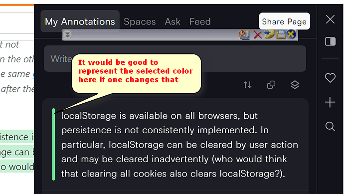
  1. It would be good if the color can be represented on the My Annotation in the sidebar (See picture)
  2. Also on the Search page. For the latter, it is not so expected but would be a logical feature addition to Filter by Colors.

Thank you for considering. It would be truly a great feature addition, truly similar to Adobe-like capability.

1 Like